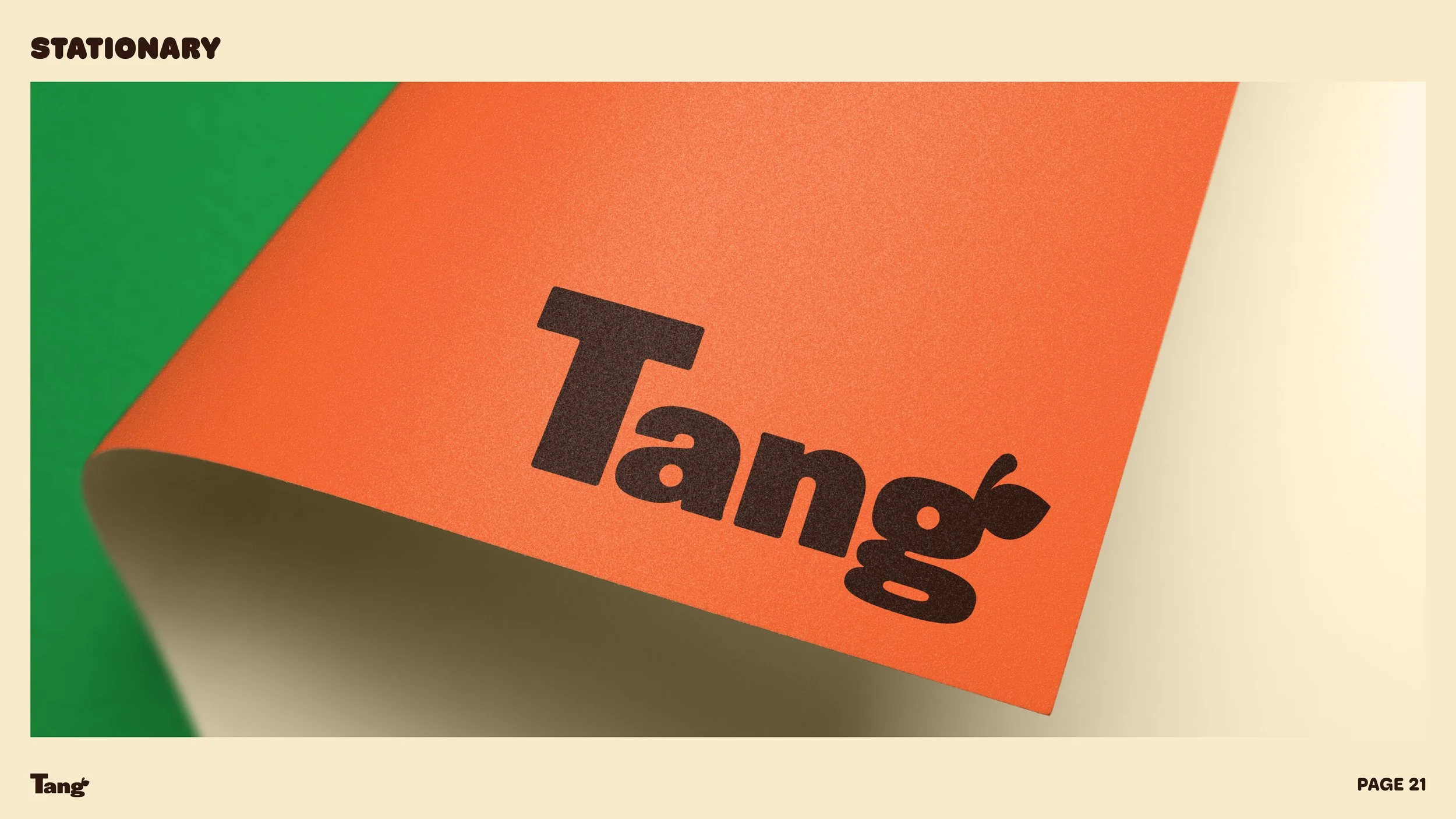
For this rebrand of the classic brand Tang, I wanted the design to emulate the nature of fruit. So with this, I created bright colors, playful typography and juicy images that emphasize the brand’s products. I wanted to incorporate textures of the fruits into the packaging. Additionally, the new branding uses simple vector lines to emphasize certain points, and emulate a child-like, playful nature to the brand. This project was awarded Chicago Portfolio School’s Best of Quarter award in the category of design.
Previous
Previous
Fast Food Rebrand
Next
Next


