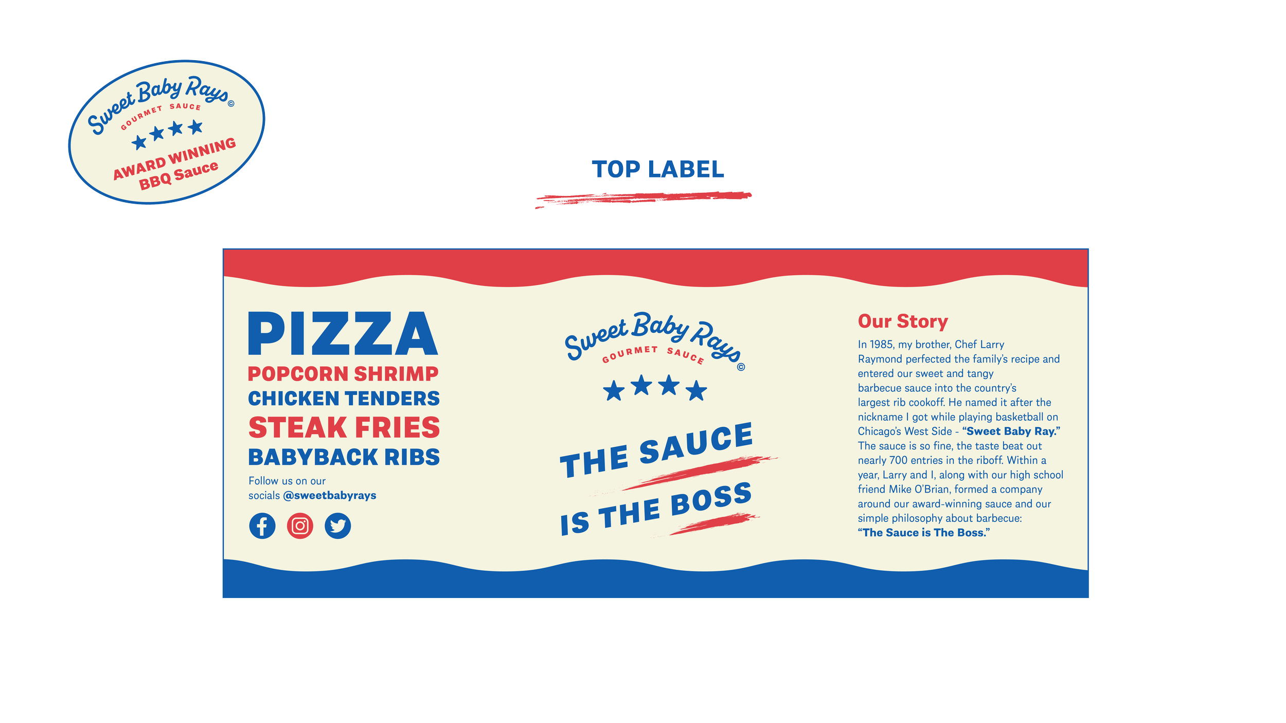
For this project, I redesigned the logo of Sweet Baby Ray’s and created packaging and advertising focused on the barbecue sauce. In terms of the design elements, these colors were picked to pay homage to the American roots of the sauce and a variety of gritty and grungy textures are now apart of the branding to emulate the grittiness and naturally messy nature of BBQ. I tried to create typography that displays all of the sauce information in a clear and concise manner, breaking away from the previous packaging which felt a bit chaotic.


